Most children's book editors will tell you that when they read a manuscript for the first time, they are always thinking about the potential illustrations. Which lines will go in the spread? What action will be illustrated? How can the illustrations and the text work together? What will the characters look like? What style of illustrations do we want? All of these questions, and more, run through our minds when we are working on a new picture book, but the last two are especially important early on. Many people might not realize that characters can go through many phases before they become what ultimately ends up in the book. And that is exactly what happened with one of our new picture books, Monster Needs a Costume by Paul Czajak, which will be the first in a new series called Monster + Me and is being published this fall by Mighty Media Kids. It's an adorable rhyming story about a monster who keeps changing his mind about what to dress up as for Halloween. Ultimately he learns that a little creativity and boldness makes for the best costume of the night. Obviously, that fun and creativity needed to come across in the illustrations as well, and over the last month, we have been working with our wonderful illustrator, Wendy Grieb, to come up with the perfect look for Monster and the little boy who takes care of him. We can't talk enough about how great of an illustrator Wendy is. Right away she had a ton of ideas for Monster, and sent us countless sketches. Here are a few of them: 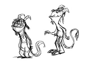
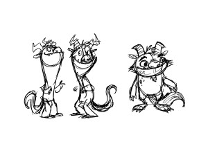
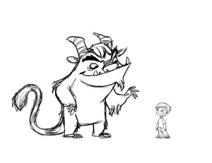
 We always knew from the text that Monster is big. He has an innocence about him, but he's definitely huge and has a significant presence in the room. So the one highlighted above seemed closest to what we were after: burly and big, but friendly. Working off of that description, we got to these (aren't they cute?):
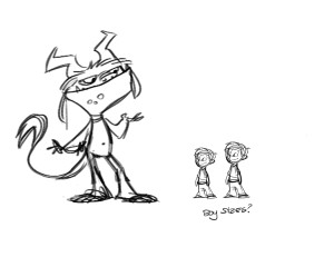
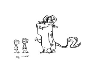
 We chose the last one, and played around with the horns and tails a bit before settling on a final look for Monster.
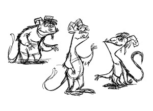
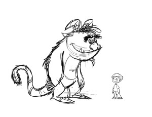
 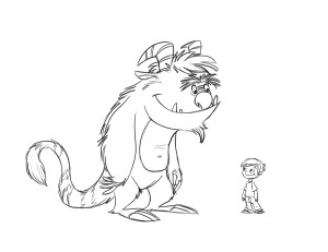 And after that, it was on to the boy. Wendy gave us a number of options (shown below), all with different features and ages, and for awhile we didn't know which to pick. After doing a bit of research we narrowed it down to the two highlighted here:
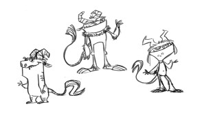
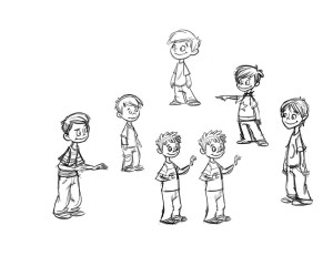
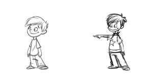 But neither was quite what we wanted. The shorter boy on the left looked a little too young for what we wanted, and the other boy wasn't quite right either and looked a little too old. But combined, they turned out to be just what we wanted. Take a look:
 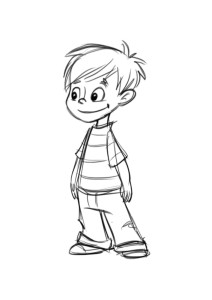 Now it was on to colors. And if you thought there was a lot to consider before, well, you ain't seen nothin' yet. We started with few different options for the boy:
 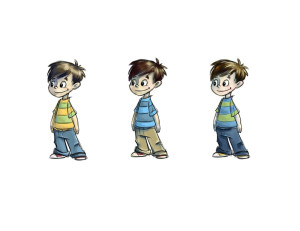 The khaki pants were great on the middle boy, but the shirt and hair color were a better option from the first boy. So again, it was time for a mix-and-match scenario. Just to be sure, we looked at the boy in both jeans and khakis before making the decision. Then the Monster was up. Take a look at some of the initial color ideas:
 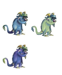 Purple was too dark, so that was thrown out. But green and blue needed to go through a couple more rounds of tweaking:
 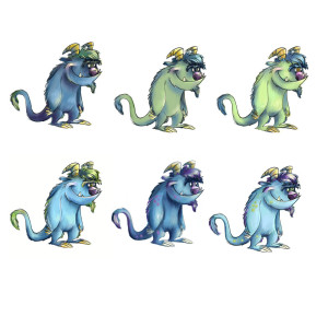 Blue seemed like the better choice, so it was time for more options with different blues. After looking at this last set, we loved number 5, but perhaps he would look better with the horn and claw color of number 1. So we took a chance, and voila! We finally had our perfect monster and boy for the new series. Now on to the actual spreads...


Comments
Sylvia Reinhardt (not verified)
Mon, 02/23/2015 - 10:48am
Permalink
Add new comment